

You’ve spent hours perfecting your business card design. The blue is striking, the red pops, everything looks vibrant on your screen. Then the printed proof arrives and the colors look dull, muddy, or just plain wrong. Sound familiar? The culprit is almost always the same: a mix-up between CMYK and RGB color modes.
If you’re a business owner ordering brochures, flyers, packaging, or any printed material, understanding the difference between these two color systems can save you money, time, and a lot of frustration. Let’s break it down in plain language.
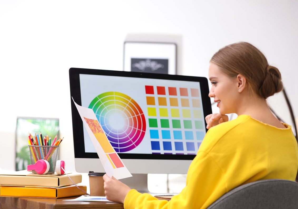
What Are CMYK and RGB? The Quick Answer
RGB stands for Red, Green, Blue. It’s the color mode used by anything with a screen: monitors, phones, TVs, tablets. Screens emit light, and by mixing red, green, and blue light, they can produce millions of vibrant colors.
CMYK stands for Cyan, Magenta, Yellow, and Key (Black). It’s the color mode used in commercial printing. Printers don’t emit light; they lay down ink on paper, and those four inks are mixed in tiny dots to recreate the colors you see.
The simple rule:
- RGB = anything that stays on a screen (websites, social media, email, video)
- CMYK = anything that gets printed (business cards, books, posters, packaging)

Why the Difference Matters: Light vs Ink
The reason these two modes exist comes down to physics. RGB is an additive color model: you start with black (no light) and add red, green, and blue light to create colors. Add all three at full strength and you get pure white.
CMYK is a subtractive color model: you start with white paper and add inks that absorb (subtract) certain wavelengths of light. Add all four inks together and you get something close to black.
Because RGB uses light, it can produce a much wider range of colors, especially bright, neon, glowing tones. CMYK simply cannot reproduce some of those colors with ink. This is why a vivid electric blue on your screen often prints as a darker, flatter navy.
CMYK vs RGB: Side by Side Comparison
| Feature | RGB | CMYK |
|---|---|---|
| Stands for | Red, Green, Blue | Cyan, Magenta, Yellow, Key (Black) |
| Color model | Additive (light based) | Subtractive (ink based) |
| Best for | Digital screens, web, social media | Printed materials |
| Color range | Wider, more vibrant | Narrower, more muted |
| File formats | JPG, PNG, GIF, MP4 | PDF (print-ready), TIFF, EPS |
| Background color | Black (no light) | White (paper) |
When to Use RGB
Use RGB for any project that will be viewed on a screen. This includes:
- Websites and landing pages
- Social media posts (Instagram, LinkedIn, Facebook, TikTok)
- Email newsletters and signatures
- Online ads and banners
- YouTube thumbnails and video content
- Digital presentations and PDFs that will only be viewed digitally
- App and UI design
When to Use CMYK
Switch to CMYK the moment your design is heading to a printer. This applies to:
- Business cards and stationery
- Brochures, flyers, and leaflets
- Posters and signage
- Packaging and product labels
- Books, magazines, and catalogs
- Branded merchandise (t-shirts, mugs, tote bags)
- Direct mail postcards
At Driftwood Editions, we always recommend supplying print files in CMYK with embedded color profiles. It gives you the most predictable result.
Common Mistakes Business Owners Make
Most print issues we see come from a handful of repeat offenders. Avoid these and your printed materials will look the way you intended.
1. Sending an RGB File to the Printer
This is the number one mistake. When a printer receives an RGB file, it has to convert it to CMYK automatically, and the conversion is rarely perfect. Bright blues turn purple, vivid greens look flat, and neon colors lose their punch. Always convert your file to CMYK before exporting.
2. Designing in Canva and Forgetting About Color Mode
Canva works in RGB by default. While the paid version allows CMYK PDF export, the free version does not. If you design in Canva for print, double check your export settings, or expect some color shift on the final product.
3. Using Pure Black as RGB (0,0,0)
Pure RGB black often translates to a flat, weak black on paper. For rich, deep blacks in print, use a CMYK “rich black” mix such as C:60, M:40, Y:40, K:100. For small text, however, stick to 100% K only to avoid registration issues.
4. Trusting Your Monitor Without Calibration
Two screens almost never display colors identically. If precise color matching is critical (for branding, packaging, or product photography), invest in monitor calibration or request a physical proof before approving a large print run.
5. Forgetting About File Resolution
Color mode is only half the battle. Print files should be at least 300 DPI at final size. A 72 DPI image grabbed from a website will look blurry when printed, no matter how perfect the color profile is.

How to Convert RGB to CMYK
Here’s how to switch color modes in the most popular design tools:
- Adobe Photoshop: Image > Mode > CMYK Color
- Adobe Illustrator: File > Document Color Mode > CMYK Color
- Adobe InDesign: Already designed for print, just ensure swatches are CMYK in the Swatches panel
- Affinity Designer / Publisher: File > Document Setup > Color > CMYK
- Canva (Pro): Share > Download > PDF Print > check “CMYK” under color profile
- Figma: Native CMYK is not supported, export to PDF and convert in Acrobat or another tool
Always preview the file after conversion. Some colors will shift, and you may want to manually adjust them so the final print matches your vision as closely as possible.
A Quick Word on Pantone (PMS) Colors
For brand-critical colors (think Coca-Cola red or Tiffany blue), neither CMYK nor RGB is precise enough. Pantone Matching System (PMS) uses pre-mixed inks to guarantee exact color reproduction across every print run. If your brand has strict color guidelines, ask your printer about Pantone spot colors.
Frequently Asked Questions
Why do we print in CMYK and not RGB?
Printers physically apply ink to paper, and those inks (cyan, magenta, yellow, black) form the basis of CMYK. RGB is based on emitted light, which paper cannot do. Sending a CMYK file gives you full control over how the colors will look once printed.
What happens if I print a file with RGB?
The printer will automatically convert it to CMYK, but the result is unpredictable. Vibrant colors often appear duller, blues may shift toward purple, and your design might not match what you saw on screen.
Are home printers CMYK or RGB?
Home inkjet printers physically use CMYK inks (sometimes with extra colors), but their drivers usually accept RGB files and convert them on the fly. For casual home printing this is fine, but for professional results, always supply CMYK.
Is Canva CMYK or RGB?
Canva works in RGB by default. Only Canva Pro allows you to export a CMYK PDF (under “PDF Print” download options). If you’re using the free version for print materials, expect some color shift.
Which is better, CMYK or RGB?
Neither is better, they serve different purposes. RGB produces brighter colors on screens, CMYK produces accurate, predictable colors on paper. Use the right one for the right job.
Can I design everything in CMYK to keep things simple?
It’s not recommended. CMYK has a smaller color range, so designs created in CMYK and then displayed on screen will look duller than they could. Design in the mode appropriate for the final output.
Final Takeaway
Understanding CMYK vs RGB is one of the simplest ways to upgrade the quality of your marketing materials. Remember the rule: screens use RGB, printers use CMYK. Convert your files before sending them to print, calibrate your expectations (and ideally your monitor), and when in doubt, ask for a physical proof.
At Driftwood Editions, we work with business owners every day to make sure their printed pieces look exactly as they imagined. If you have a project coming up and want to make sure the colors come out right, get in touch with our team and we’ll guide you through the file prep process.